Converting free users into premium
Optimizing pricing page & onboarding flow for a B2C product
B2C • Conversion optimization • Pricing design • Onboarding • WebApp
CONTEXT
The project involved a B2C web app in the housing and rental market, helping young urban renters find apartments and flatmates in competitive city environments. The platform runs a freemium model with a premium subscription tier targeting price-sensitive users between 18 and 35 living in major cities. This case has been anonymized to protect client confidentiality.
ROLE
Solo UX/UI Designer, collaborating directly with the CEO & Founder over 3 month freelance engagement.
PROBLEM
Many users were signing up but not converting to premium. The client identified this through usage data and brought me in to investigate. Looking at the full user journey it became clear there were two separate but connected problems. First, the pricing page itself was not making a compelling case for premium. Second, new users were never encountering the premium offer during signup at all, meaning most people landed directly into free usage habits without ever making a conscious choice about upgrading.
—> These two problems needed to be solved in sequence: fix how premium was presented, then bring that improved presentation into the onboarding flow.
MY APPROACH
The client shared conversion insights from his analytics and we quickly aligned on scope and goals together. For each part of the project I researched best practices across similar B2C freemium products before developing solution proposals for his feedback. The process was intentionally lean throughout: fast iteration, direct collaboration, no unnecessary overhead.
STEP 1: REDESIGNING PRICING PAGE
PROBLEM
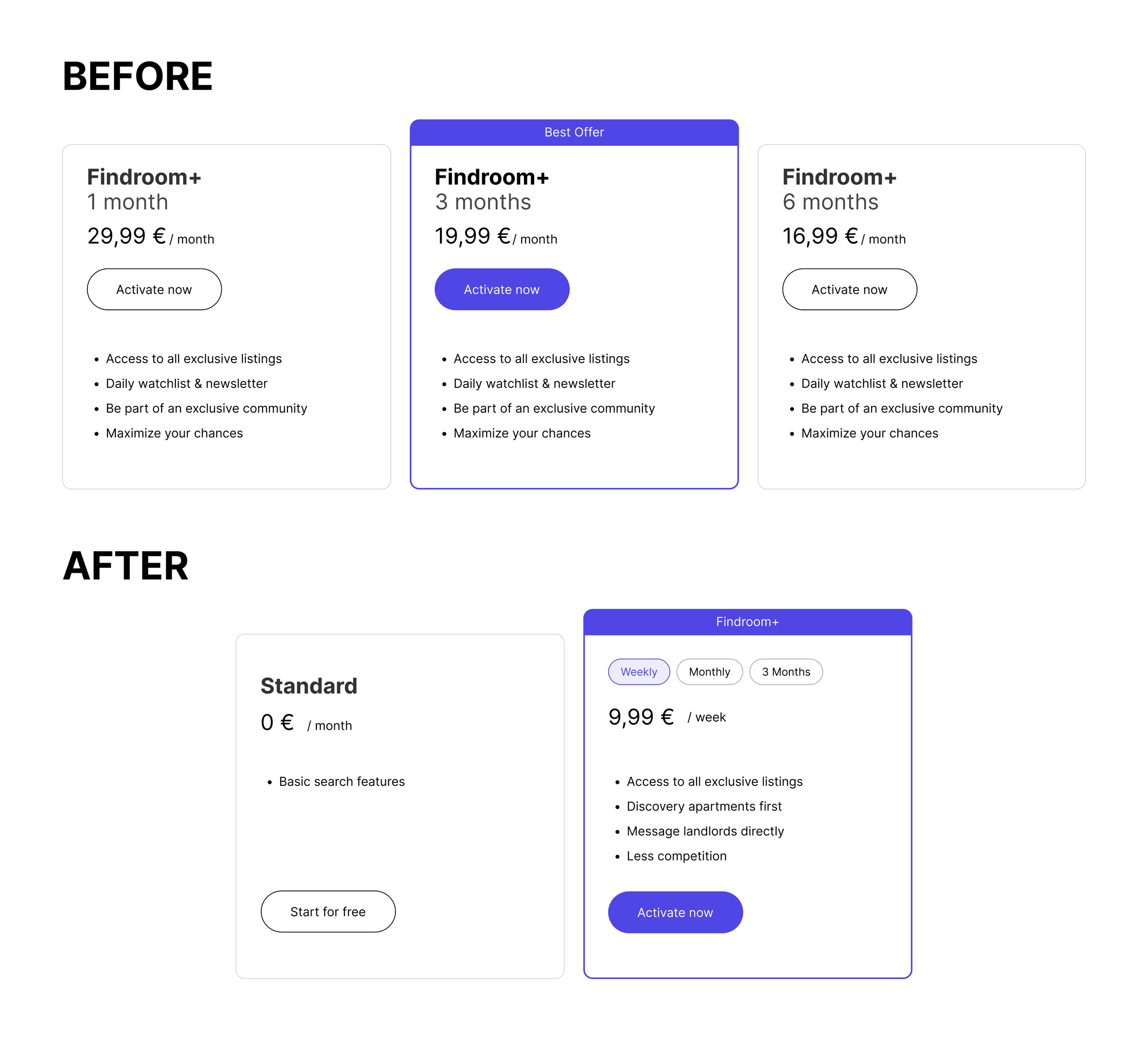
The pricing page showed three subscription options (1, 3 + 6 months) with identical feature lists across all three cards, making it impossible for users to understand the actual value difference between plans.
The free version was not visible anywhere in the pricing overview, removing any anchoring context that would help users appreciate what premium actually offered.
The overall page felt redundant, visually cluttered and unconvincing.
KEY DECISION
Before
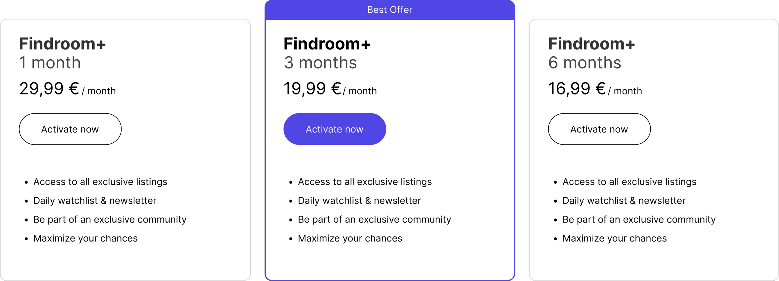
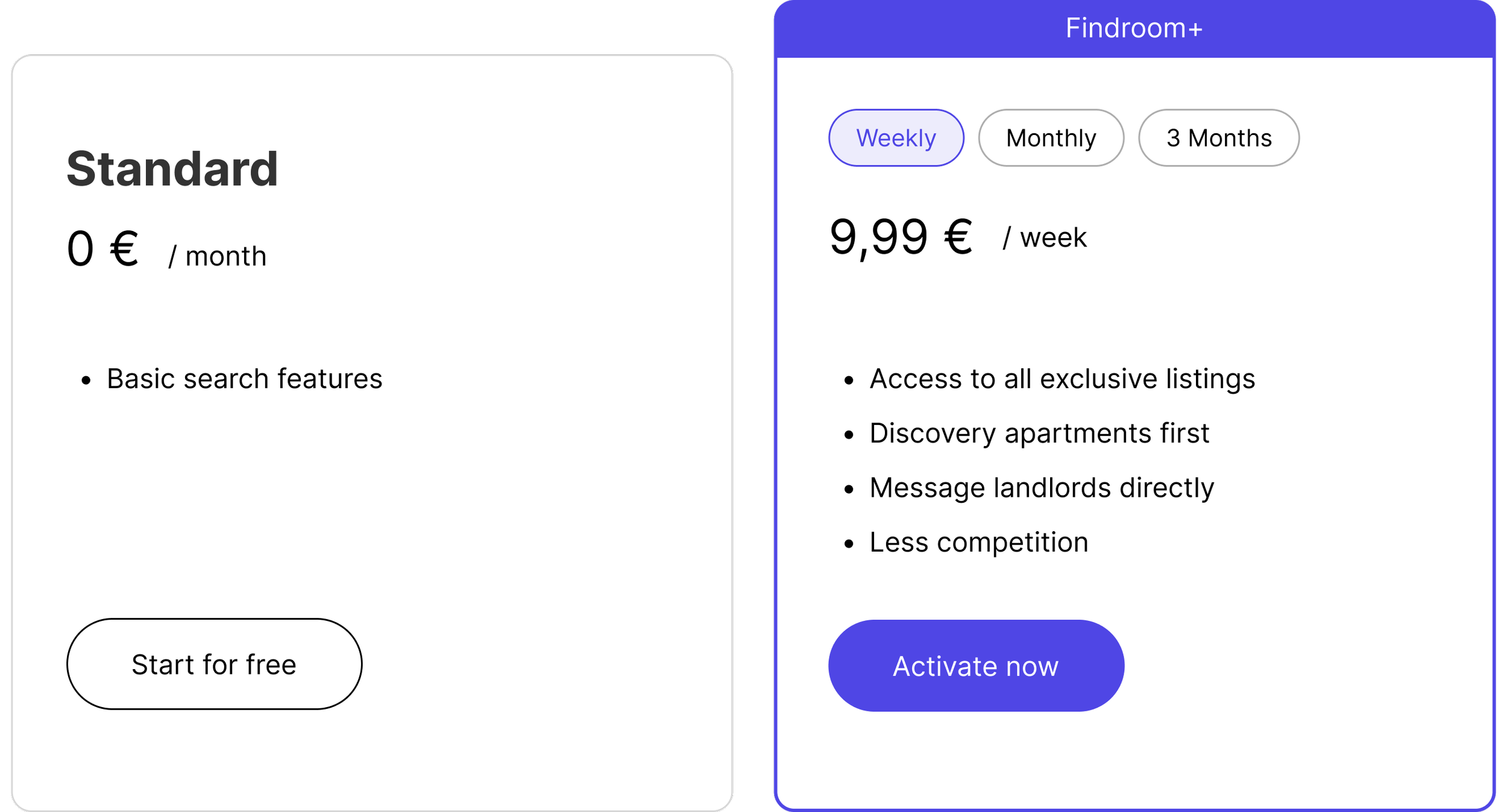
The most important shift was introducing the free plan directly into comparison. This is a well established pattern in freemium products because it forces users to consciously compare what they get for free versus what they unlock with premium, making the value proposition immediately tangible rather than abstract.
I simplified the feature list to focus on concrete, action oriented benefits rather than vague descriptions. Instead of repeating the same bullet points across all plans, the premium card now communicates specific advantages that speak directly to the frustrations of young renters in a competitive housing market, like discovering apartments first and messaging landlords directly.
The three separate plan cards were replaced with a duration toggle to reduce visual clutter and simplify the decision. The weekly payment option was introduced as a deliberate psychological anchor for price-sensitive users, lowering the perceived commitment barrier even if the long-term cost is higher.
OUTCOME
The redesigned pricing page resulted in clearer user decision making and increased interaction with the upgrade flow. The client reported improved conversion behavior following the change. The simplified structure also made the page significantly easier to maintain and iterate on going forward.
After
STEP 2: ADD PREMIUM TO ONBOARDING
PROBLEM
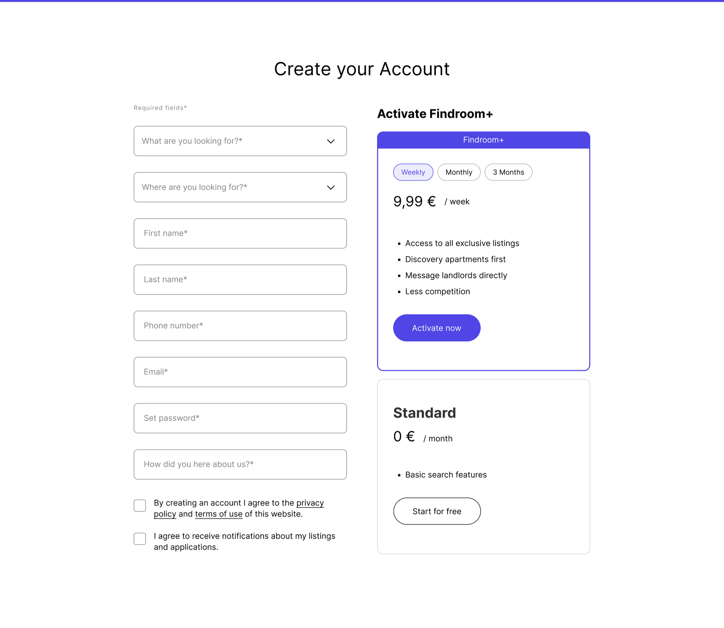
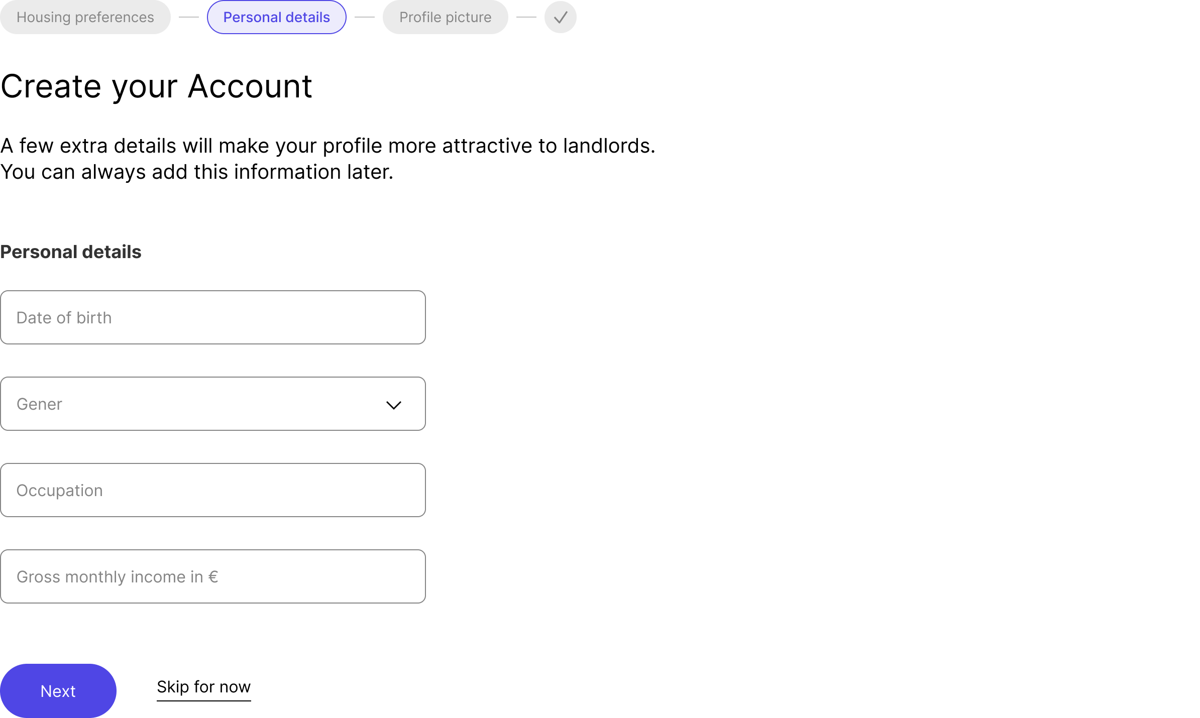
With a clearer pricing page in place, the next challenge was ensuring users actually encountered the premium offer before settling into free usage habits. The existing onboarding flow collected basic account details like name, contact information and what the user was looking for, but never introduced the premium model at any point. By the time users were inside the product and comfortable with the free version, converting them became significantly harder. The goal was to create premium awareness at the highest attention moment: account creation.
ITERATION
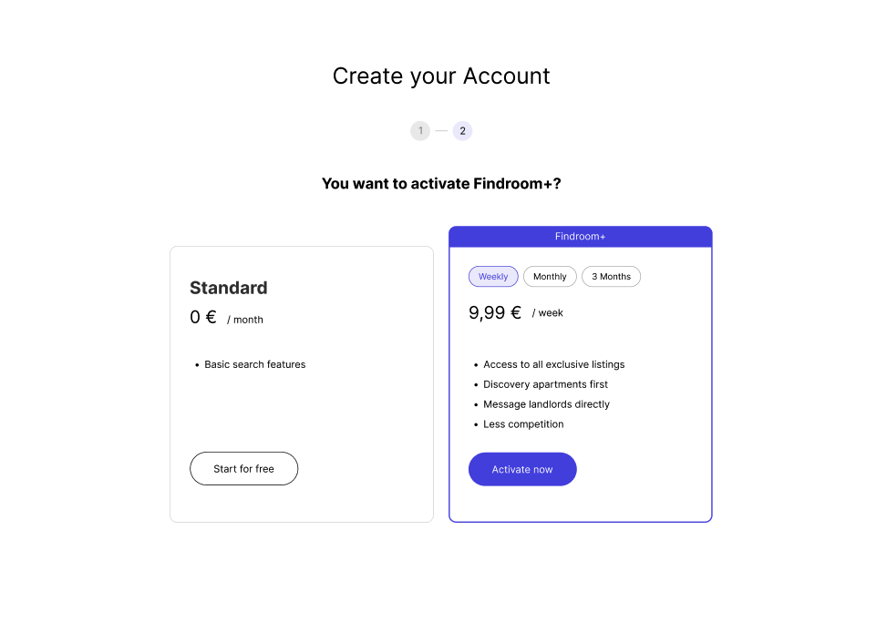
One-step onboarding placed the registration form and the pricing decision side by side on a single screen. This created immediate premium awareness without adding any extra steps to the flow, keeping the process fast while ensuring the upgrade option was impossible to miss.
Concept 2: Two-step approach
Two-step onboarding kept the registration form on step one and introduced the pricing decision as a dedicated second step right after account creation. This gave the pricing moment more visual focus but added friction to the signup process.
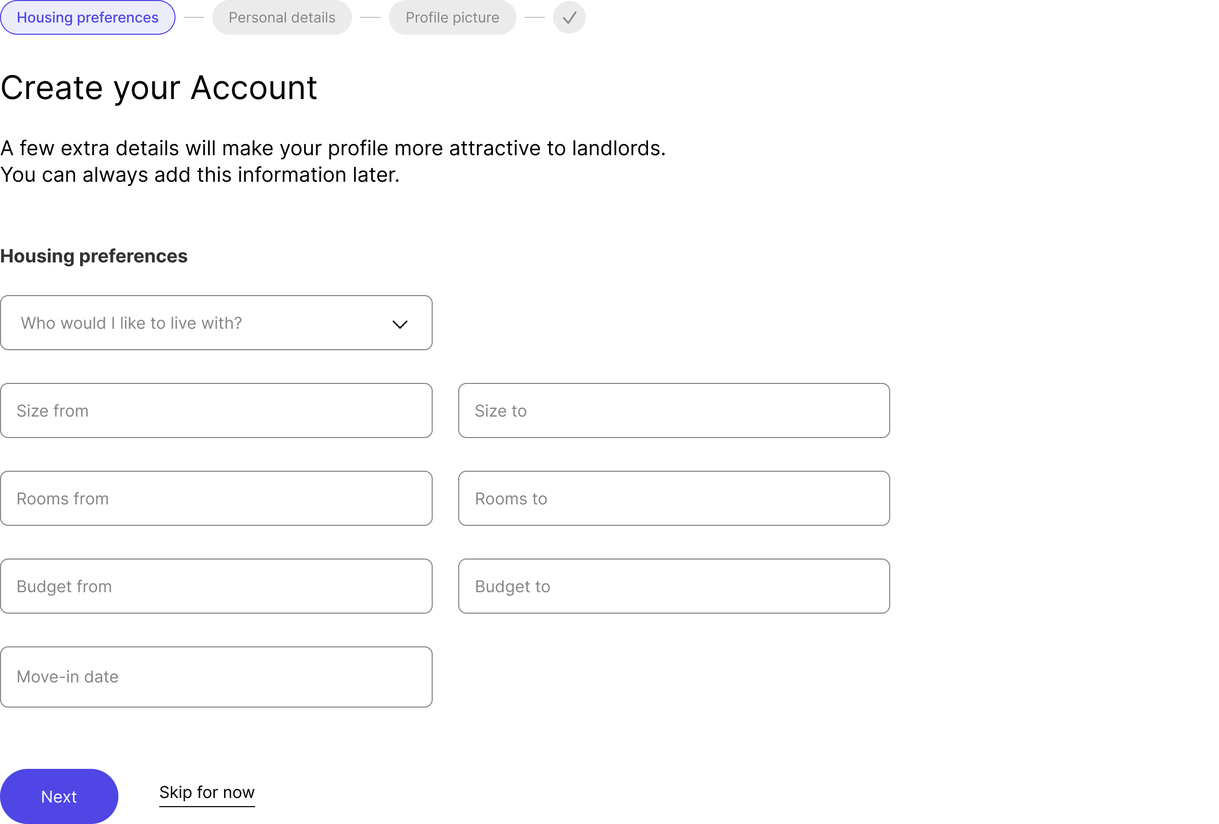
Multiple-step profile completion went further by adding a full profile setup flow after registration, covering housing preferences, personal details and a profile photo, with the pricing decision embedded within it. This created the most complete user profile but was the longest path to getting started.

KEY DECISION
The one-step solution was chosen for its simplicity and efficiency. Beyond the obvious UX benefits of fewer steps, it also makes a strong strategic argument: placing the premium offer next to the registration form means the user encounters it at peak motivation, before free usage patterns have formed. A user who actively chooses the free plan during signup is far more aware of what they are missing than a user who never saw the option at all.
Mobile responsiveness was a critical consideration throughout since the majority of the target audience uses the platform on mobile screens. The one-step layout required careful attention to hierarchy and spacing to work cleanly across screen sizes without feeling cluttered.
OUTCOME
The new onboarding flow introduced a clear premium touchpoint into the signup experience for the first time.
The client responded positively to the one-step approach for its balance of speed and strategic placement of the upgrade decision. The solution aligned with both the business goal of increasing premium awareness and the user goal of getting started quickly without unnecessary friction.
OVERALL REFLECTION

Tackling the conversion problem across both touchpoints created a more coherent premium experience from first impression to signup. The pricing page gave users a clear reason to consider upgrading. The onboarding flow ensured that consideration happened at the right moment. Together they addressed conversion as a journey problem rather than a single page fix, which is ultimately where the real opportunity was.

Concept 3: Multiple-step profile
I developed three distinct onboarding concepts to explore the right balance between signup efficiency and premium visibility.
Concept 1: One-step approach